Colour innovation and sustainability at Interzum 2025
Saviola is pleased to present its partnership with ColorNetwork® at Interzum 2025 in Cologne. A union born from the sharing of key values: Design, Sustainability and Innovation.
Colours that inspire, surfaces that speak
Thanks to the collaboration with ColorNetwork, we offer a range of colours designed to anticipate market trends, perfectly matched with wood, cement and stone finishes. All with a sustainable approach, thanks to our exclusive Ecological® Panel, made from 100% recycled wood.
The exhibition space will be organized in different settings, which will repropose the main spaces of a house through furniture and wall solutions. Here you can discover the perfect harmony between surfaces and colors, thanks to the shades selected in collaboration with ColorNetwork:
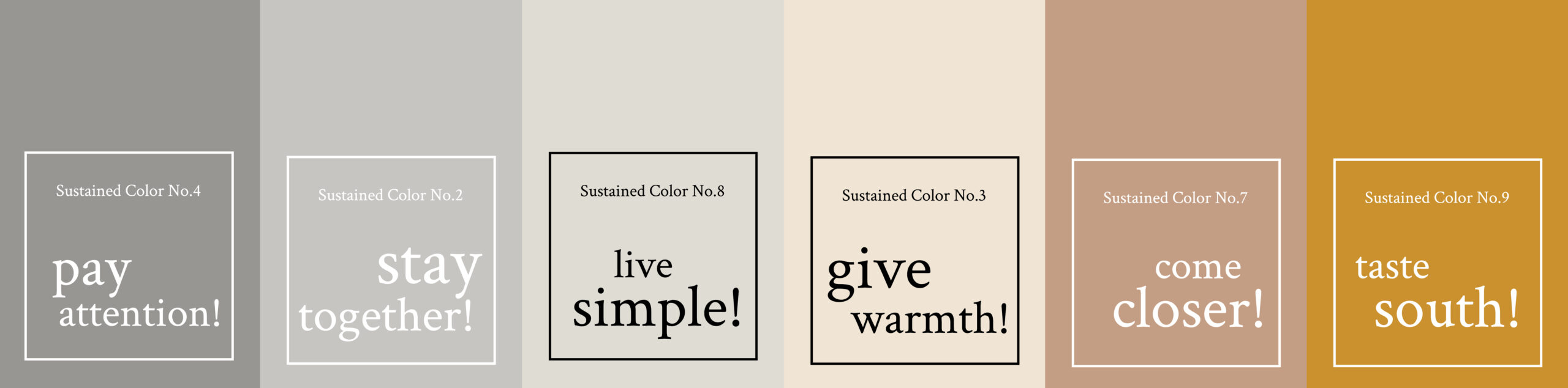
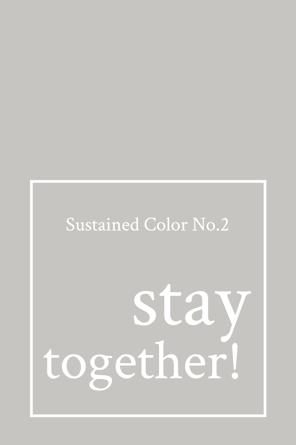
No. 2 STAY TOGETHER
“Stay Together!” is the emblem of a flexible and harmonious design. Inspired by concrete, it combines solidity and versatility, adapting to natural and industrial materials to create welcoming and dynamic spaces. Its light grey, neutral and sophisticated, stimulates new ideas and sensations, offering infinite possibilities of interpretation in contemporary design.
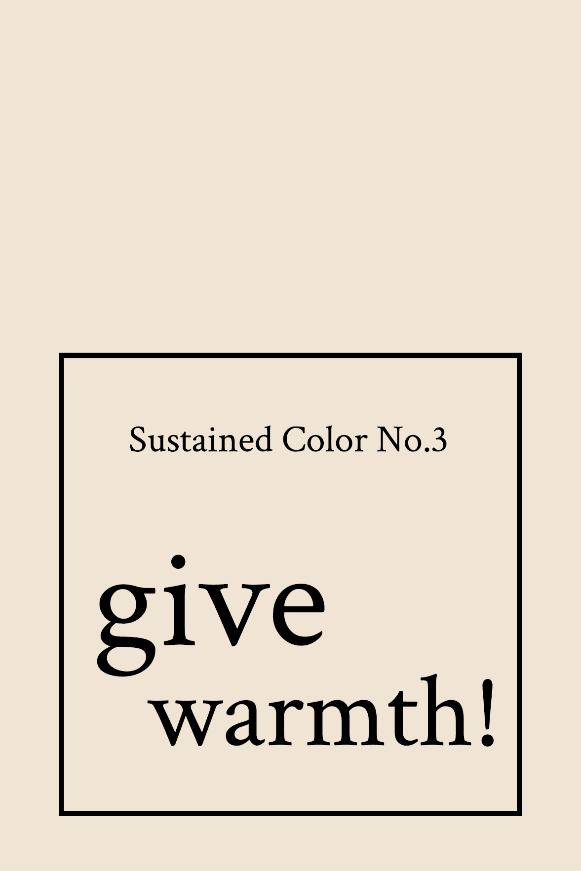
No. 3 GIVE WARMTH!
“Give Warmth! It is a warm sand shade that envelops the spaces in a welcoming and natural atmosphere. Perfect with tarnished wood and sand marble, it evokes the warmth of the sun and the serenity of holidays, transforming every room into a haven of well-being and balance.
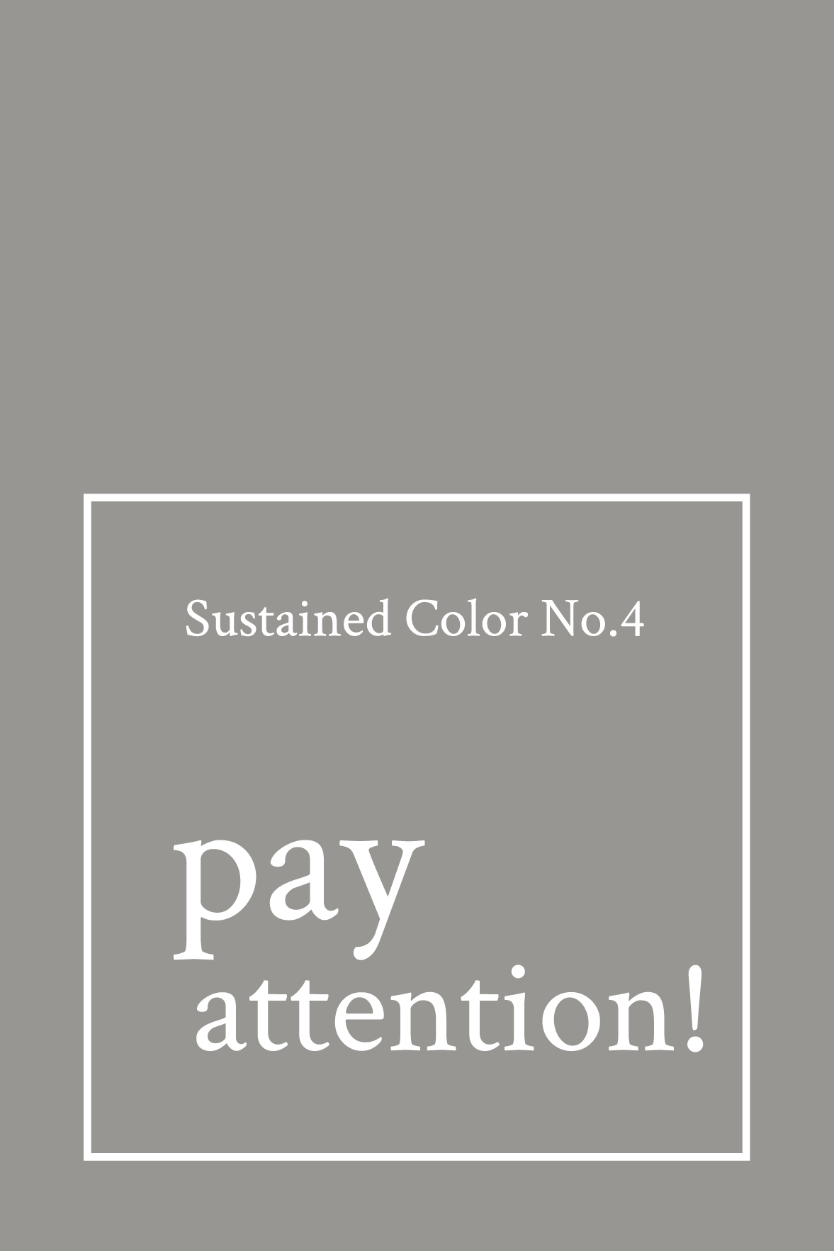
No. 4 PAY ATTENTION!
Grey No. 4 “pay attention!” gives balance and depth to the interior, creating an elegant and timeless atmosphere. Sophisticated and discreet, it enhances every design detail and, combined with golden woods and warm metals, exudes naturalness and warmth. Its nuances recall the solidity of stone and the lightness of smoke, with notes of cedar, tobacco and incense. More than a color, it is an invitation to awareness, transforming the space into a haven of harmony and beauty.
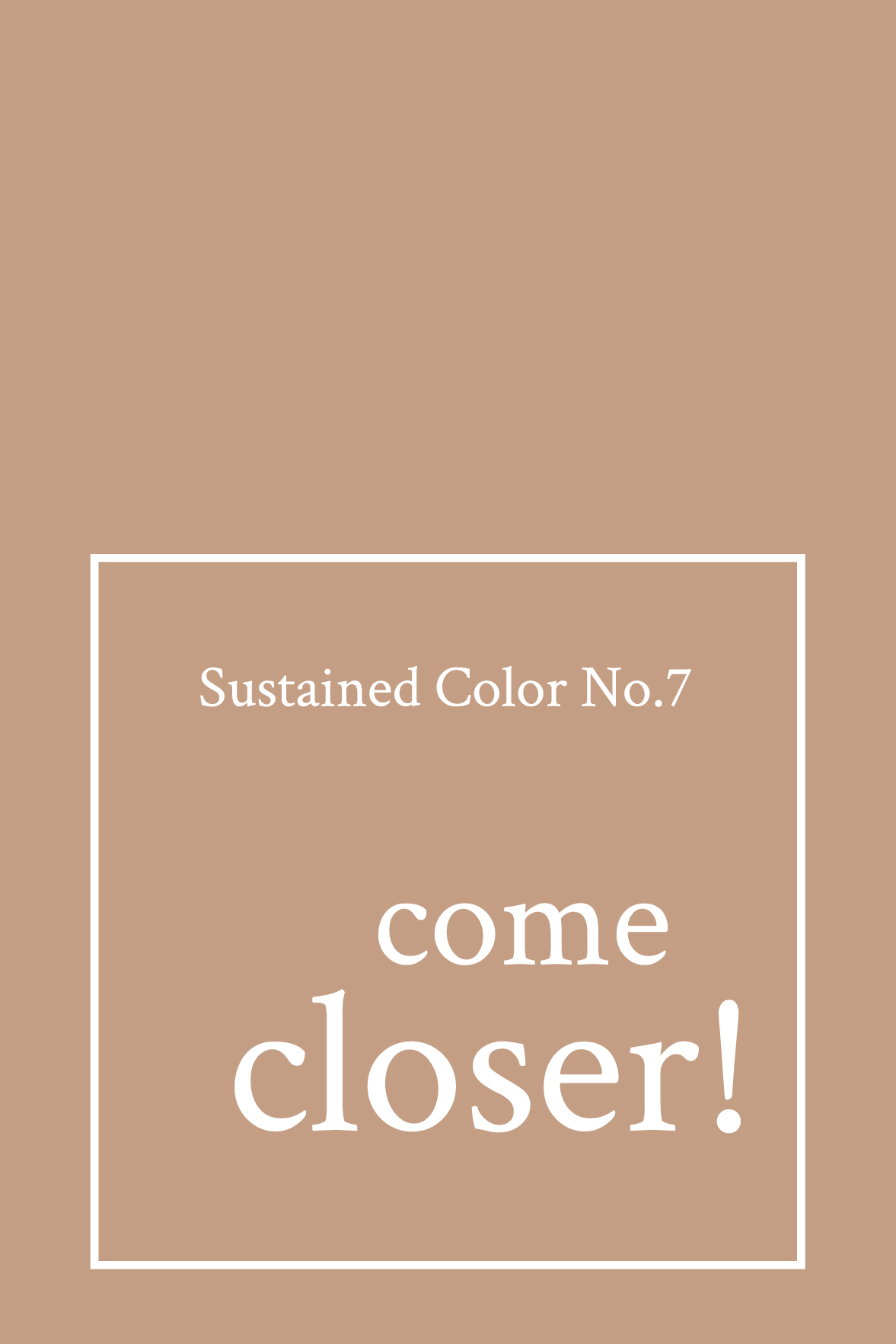
No. 7 COME CLOSER!
Color No.7 “come closer!” is a warm medium-dark caramel that envelops spaces in a sensual and cozy atmosphere. Inspired by the desire for closeness and conviviality, it recalls the softness of melted chocolate and vanilla, offering a multi-sensory experience. Versatile and refined, it gives depth to the materials and, enriched by olfactory notes of vanilla, toffee and cocoa, transforms the environment into a haven of pure well-being and sharing.
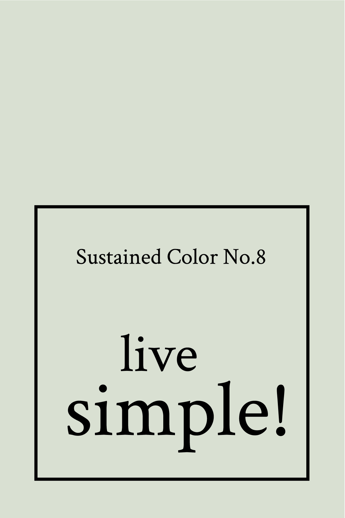
No. 8 LIVE SIMPLE!
Color No. 8 “live simple!” is a refined and versatile white, inspired by the purity of nature and the freedom of spaces. It recalls the warm shades of conchiglifero limestone, spreading a sober and timeless elegance. Caressed by light, it reveals delicate grey tones and a fresh and marine olfactory aura, with notes of flax, white flowers and smoked woods. More than a colour, it is an invitation to lightness, awareness and essential beauty.
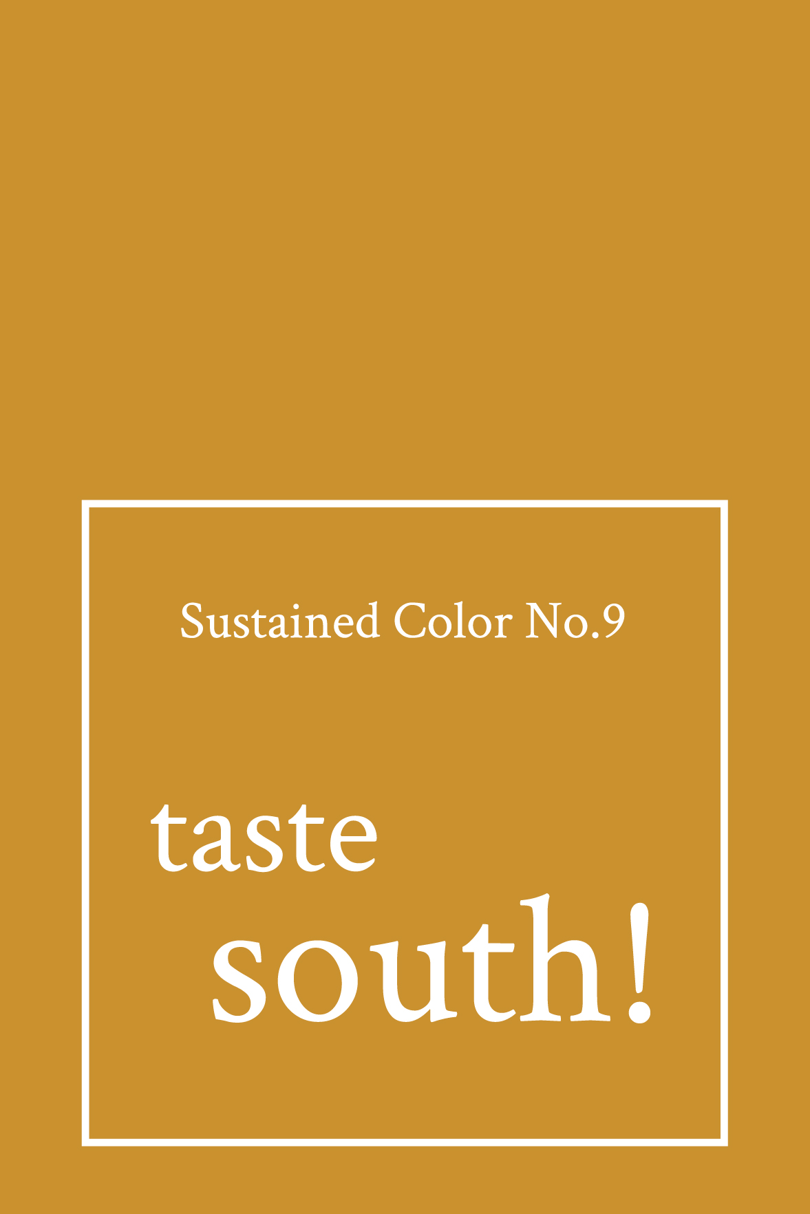
No. 9 TASTE SOUTH!
n.9 Taste South is a solid colour that recalls the warmth and light of southern Italy. Its tone, close to the ochre yellow, evokes the intense colors of ripe citrus fruits, sunny lands and days that run slow under the sun. A colour that smells of dolce vita, Mediterranean conviviality and timeless beauty. Taste South is an invitation to experience spaces with warmth, energy and authentic style.